 Why do you need aluminum skirting for the countertop?
Practical advice: we have a kitchen set in the kitchen of 6 sq.m.
The phrase of Zhenya Lukashin from “Irony of Fate” “You and I have not very big apartments” can be easily applied to a relatively standard 6-square-meter kitchen sector m., characteristic of many buildings of the second half of the 20th century.
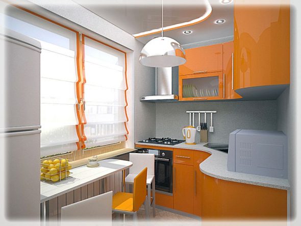
Kitchen design 6 square. m should be equipped as attractively as possible.
A person engaged in social work, labor at work should pay little attention to his own life, therefore ideological designers believed that he didn’t need a lot of room. Modern people are forced to adapt a limited amount of such apartments to the realities of their own lives.
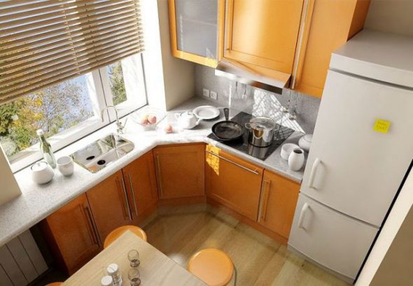
To do this, it is important to choose the right one, take into account every nuance of the repair and use only suitable solutions that will harmoniously fit into the interior.
How to design a kitchen so that the compressed space expands its possibilities, becomes comfortable, cozy, full-fledged? How to distribute the minimum necessary set of furniture to leave room for free movement?
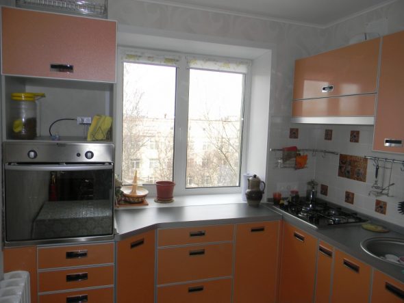
A key role in the design of the kitchen of 6 square meters is its functionality.
Content
- 1 Design a small kitchen design
- 2 Choice of furniture placement options
- 3 The peculiarity of the "letter" options
- 4 The use of "linear" variations of the location of kitchen furniture
- 5 Simplicity, accurate calculation and color scheme - three whales of a successful kitchen design
- 6 Useful Tricks of Kitchen Design
- 7 VIDEO: Kitchen interior design 6 sq.m.
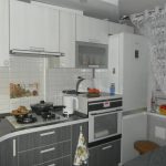
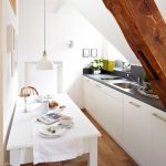
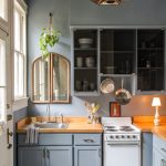
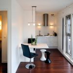
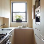
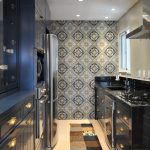
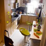
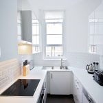
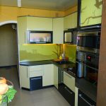
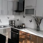
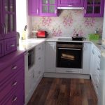
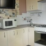
- 8 Kitchen design 6 square. meters - 50 photo ideas:
Design a small kitchen design
The implementation of each design project begins with answers to questions:
- Who is it for?
- What tasks must be solved?
- What are the pros and cons of the layout of the available premises?
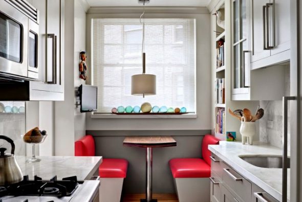
Kitchen design, the completeness of the furniture set depends a lot on the lifestyle of apartment dwellers.
It is imperative to take into account their rhythm of existence, features of characters and hobbies.
| Number of persons | 1-2 people | Big family |
| Lifestyle, diet | Breakfast, dinner (often outside the home) When receiving guests - order delivery of meals, purchased snacks | Traditional full breakfasts, lunches, dinners |
| Recommendations for the organization of the kitchen space | The kitchen is a technological compartment. When allocating the common area of the kitchen-living room, meals are organized at the bar counter, on the worktop of the kitchen unit. | Redevelopment of the apartment - demolishing a section of a wall or cutting through a wide opening, combining a kitchen with a common room, forming a living-dining room, putting a dining group into the dining area |
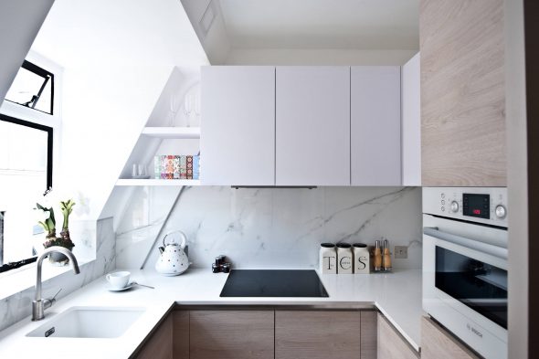
Typical kitchen areas have a rectangular shape.
The standard small kitchen is an almost square room with a door and a window on opposite walls, and the door is almost adjacent to the perpendicular wall surface. However, there are other projects:
- Stretched room with a window in the end
- Stretched room with a window at the top of a long wall
- The room with the location of the entrance in the center of the wall opposite the window
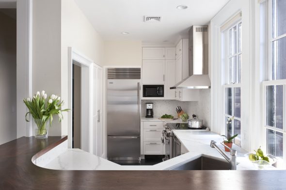
Depending on the layout available, various ways of arranging large-sized kitchen items are offered.
Choice of furniture placement options
The basic rule of ergonomics for the design of a kitchen is the use of a “triangle”, where the tops are the refrigerator, stove and kitchen sink. Applying a triangular layout, a person spends less time and effort on movement in the process of cooking.
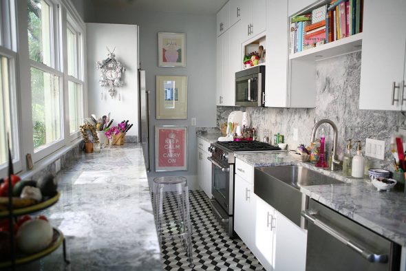
The ideal location of kitchen furniture and appliances is described by the rule of the triangle: storage area, sink area, cooking zone.
In a variant of a small kitchen, a linear arrangement is also applicable: a refrigeration unit, a hob, a sink. Regardless of the left or right execution, when drawing up a detailed project, it is necessary to take into account the sequence of technological processes:
- Pproducts are removed from the refrigerator
- Mare prepared and prepared
- Psubject to culinary processing
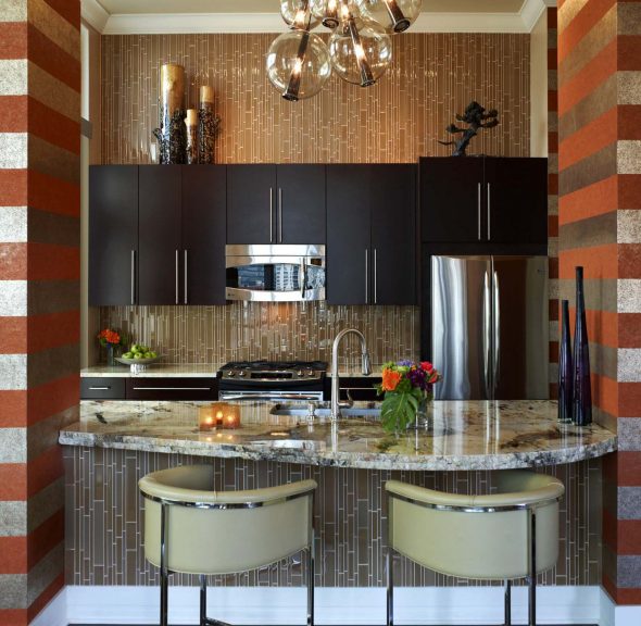
A special moment is the alternation of kitchen equipment with intervals of the working surface of the table.
A person needs free space for intermediate works.For a small kitchen, the “triangle axiom” often becomes an “arm-length constant”, i.e. the area of the room is so limited that the person practically does not have to move on it to perform actions.
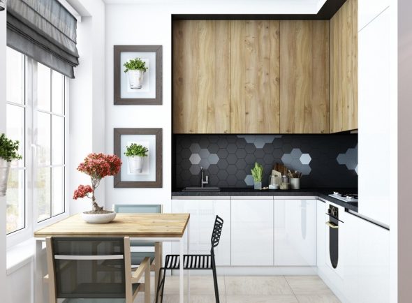
The most important when planning the interior design of a small kitchen is the most ergonomic placement of furniture and equipment.
Accordingly, the planning of kitchen space offers several ways to arrange furniture:
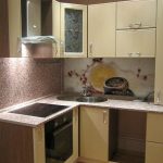
- L-shaped
- U-shaped
- Linear
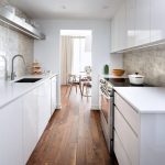
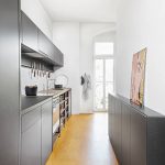
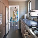
- Parallel
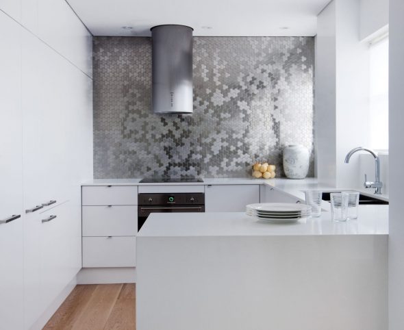
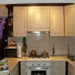
U-shaped kitchen layout: everything is at hand.
The peculiarity of the "letter" options
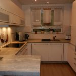
In the case of connecting a small kitchen to the living room and the formation of a kitchen "niche" intended only for cooking, the application will be successful option number 2where the U-shaped design can be turned with the open side to both the living room (three closed sides go along 2 walls and under the window) and to the window.
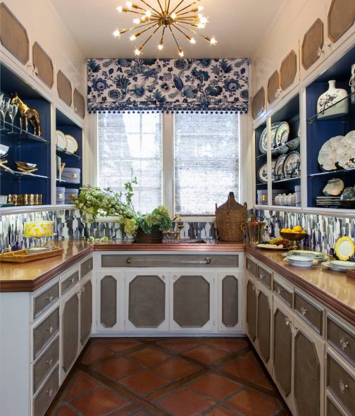
In the second case, one of the closed sides is shortened, forming a bar counter or a continuation of the working surface.
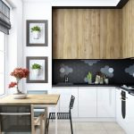
U-shaped version implies a similar layout for the bottom row. The top row of modules is better placed on the far wall, because protruding wall cabinets on the side plane will optically clutter the space, making the small kitchen microscopic.
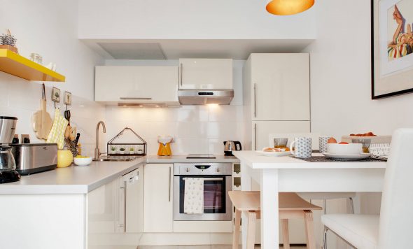
Designers of kitchen studios are advised to recruit modules to the ceiling, without leaving an open recess above them. This creates an additional storage of non-first-use accessories (table linens, bulk pans, kitchen appliances — combine harvester, bread maker, steamer), and also cleaning is made easier.
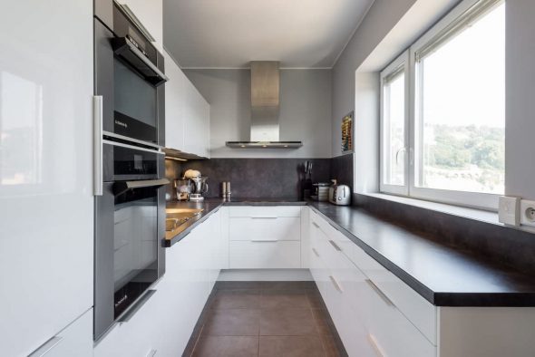
Use the sill area as effectively as possible.
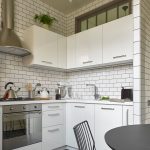
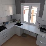
Option number 1 involves the implementation of the arrangement in a closed square kitchen. The main load falls on the back wall, where a refrigerator, a sink and a stove are displayed in a row with minimum intervals. The upper bar of the letter "G" is joined to the wall with the entrance opening. This is a series of lower cabinets with reduced depth and top playing the role of the main work surface.
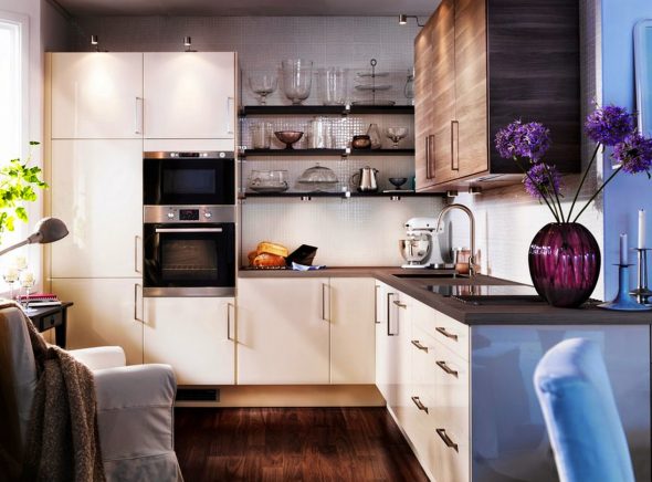
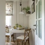
In a narrow kitchen, a window sill will be used as a very good outlet for the dining area.
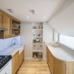
The mirror image of the variant is the device of the working surface, which captures the window sill, along the entire wall opposite the entrance door.
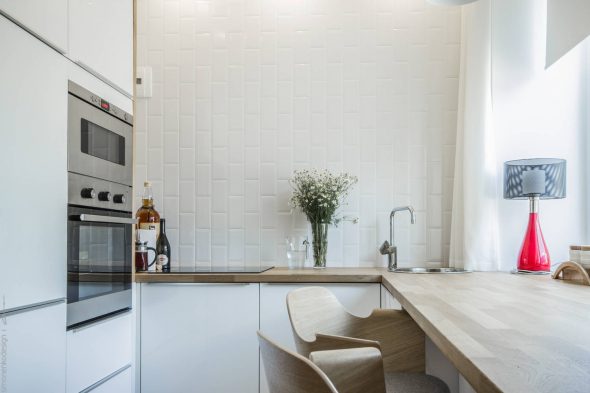
Part of the worktop can be given under the breakfast area, and part of the bottom is complemented by closed kitchen cabinets.
The use of "linear" variations of the location of kitchen furniture
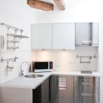
The design of a kitchen of limited dimensions will be able to combine only a minimal set of furniture. Option number 3 assumes that the landlord is an individualist, not concerned with the problems of nutrition. The main features of the "single line" project:
- Rdistribution of kitchen modules in one line
- Hfilling the entire wall with lockers
- ATbuilding low models of refrigeration devices that fit under the countertop
- ATcutting hobs on 2 burners
- ATSelection of a minimum volume sink
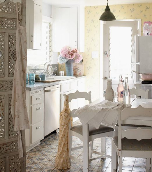
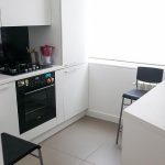
The use of the “linear” version and reduced models of all kitchen equipment allows you to enter into the kitchen design a stand-alone breakfast table with full chairs.
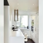
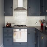
Option number 4 - “parallel worlds” is a way of organizing kitchen space when there are 2 end walls with wide walls to the window and door openings. In this case, the refrigerator should be combined with the sink in one plane, and the hob should be transferred to the opposite wall.
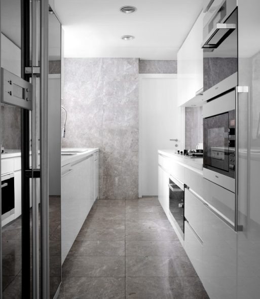
It can be made full-length, or cut in half, if the miracle ovens are responsible for cooking.
On the same side it is better to arrange a microwave, oven, toaster, coffee maker. It will be more convenient to raise the microwave or the coffee machine higher, hide it inside the wall cabinet, and not clutter the horizontal surface.
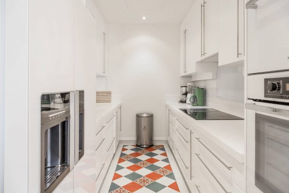
The construction of kitchen cases up to the ceiling will not significantly reduce the volume, but will allow a variety of storage places to appear, which is important in a small kitchen.
Simplicity, accurate calculation and color scheme - three whales of a successful kitchen design
The difficult moment when choosing a kitchen set becomes the search for a suitable palette. In a small closed kitchen, bright furniture will suppress its saturation, the abundance of color inside a limited space is annoying.
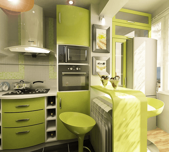
Intense color spots begin to dominate, dictate the mood of the owners.
Studies in the field of color psychology confirm:
- TOred - provokes aggressive behavior
- Fviolet - depressing
- Fyellow, in small patches capable of creating a sunny mood of joy, in general, has a negative effect on people's mental health
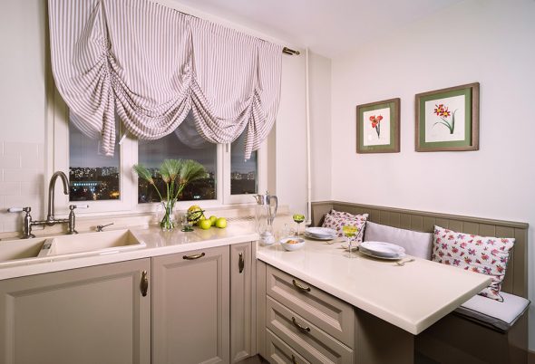
The preferred color spectrum for kitchen fronts is neutral, pastel colors.
Also, do not use for the headset front surfaces with a texture or pattern, dark wood, characteristic of pompous classicism or a good country. Heavy massive kitchen design fills the entire room.
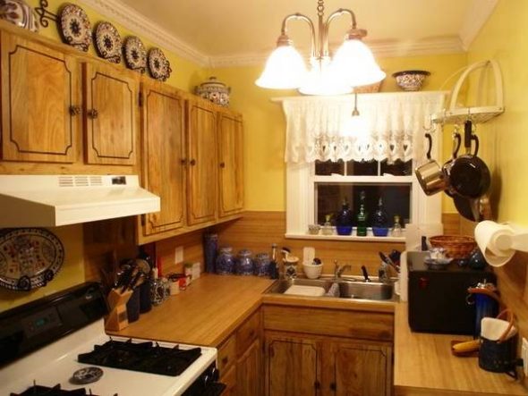
Too many decorations, carved parts crush the overall impression.
The best option - more simplicity, tranquility, elegance, making the kitchen stylish. Minimalism, modern classics, Scandinavian style, hi-tech, eco-style - these varieties are perfect for creating a thoughtful, technological and well-equipped space.
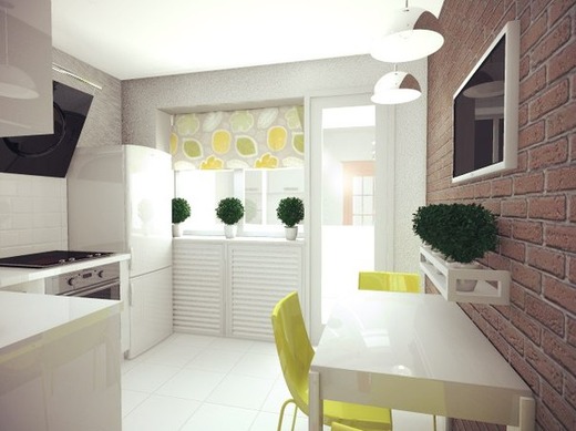
Another important point is the color of the kitchen with 6 square meters: it is very important to use light colors.
Optically expand the limited size of the kitchen, make it more voluminous allow glossy (reflective) facades of kitchen furniture, glass apron and mirrors.
- RThe lascous gloss of the facades reflects objects
- Hmirror adds a small kitchen light, expand dimensions
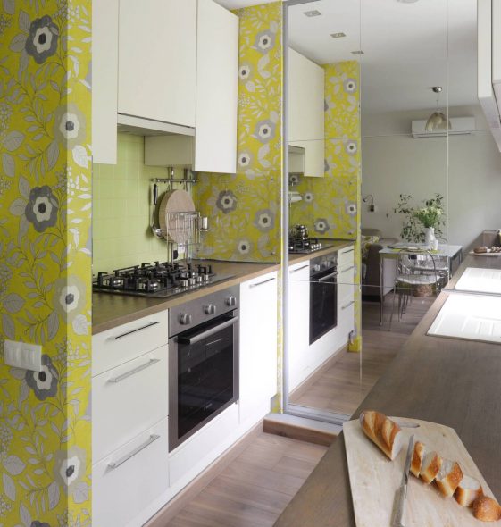
A large full-length mirror is a reception that visually expands the space, works seamlessly in the kitchen with a small dining area.
Useful Tricks of Kitchen Design
To add additional functions to the kitchen space, it is necessary to measure each centimeter, analyze the advantages of a small space, carefully camouflage all the details that differ in shape or color, apply design ideas that extend the capabilities of ordinary objects.
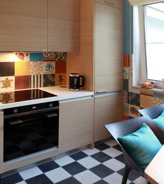
When designing a kitchen set it is necessary to take into account all the special moments that make it more convenient.
- To completely hide the working niche in the kitchen area will help the installation of roller shutters of the type of archival cabinet.
- Large-sized items (refrigerator, dishwasher, oven) is better to buy built-in type - the same closed canisters, filling the whole wall, make bulk furniture and appliances less noticeable.
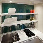
- Facilitate the room, make it airy help open shelves with a minimum of decor.
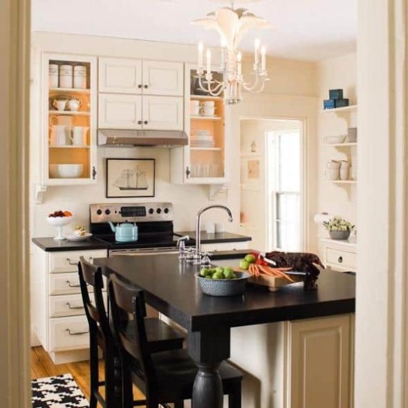
Many wall storage techniques will help where the installation of cabinets is impossible or undesirable.
- To increase storage, it is worthwhile to provide drawers instead of a headset base, fixings for covers, cutting boards on the inside of furniture doors. Narrow shelves will take the place of the front strips covering the openings from the modules to the walls.
- A full-fledged table will successfully replace a small roll-out table, perpendicular to the kitchen tabletop or window-sill, a folding fan of surfaces fixed under the bar, and a lifting wall table. In the latter version, folding chairs, suspended from wall hooks, will become a kind of décor in loft style.
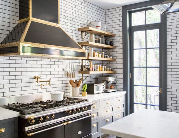
These simple tips will allow you to create, even in such small areas, a real masterpiece, which you will be happy to show to all your friends.
VIDEO: Kitchen interior design 6 sq.m.
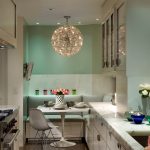
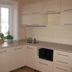
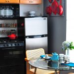
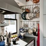
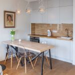
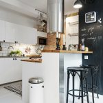
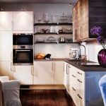
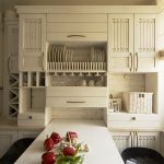
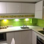
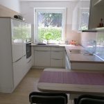
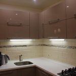
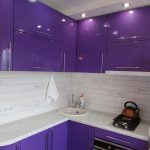
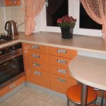
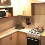
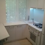
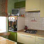
Kitchen design 6 square. meters - 50 photo ideas:
 Why do you need aluminum skirting for the countertop?
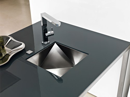 How to cut a hole under the sink in the countertop?
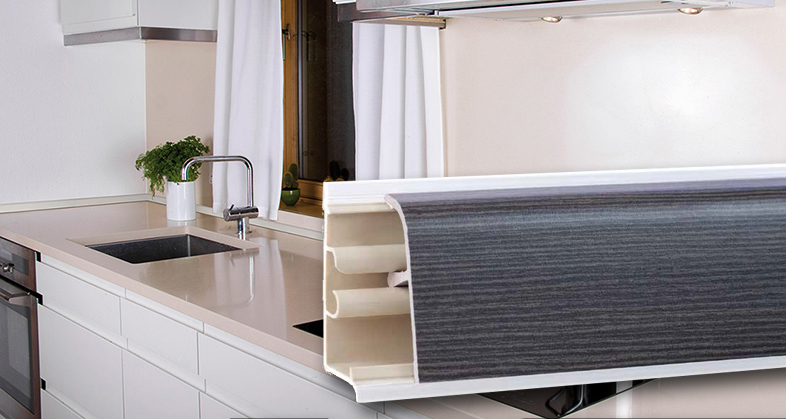 Fasten the plinth to the tabletop by yourself.
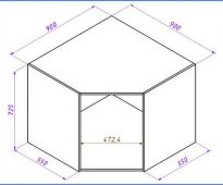 Standard sizes of kitchen cabinets
 Choosing a cabinet for built-in oven
 We do the restoration of the kitchen set with your own hands
